OPPO.com – Redesigning a truly global e-comm website

Role
UX Researcher
and UX Designer
With
Hello Monday-team
for OPPO.com
When
Autumn 2019
Launch project
OPPO.com
Introduction
OPPO.com is OPPO’s most important platform for online brand image communication, and it’s most important digital marketing channel. But, in its previous state, the site suffered from low user engagement due to its reliance on a banner-based structure which led to poor information hierarchy and other key challenges.
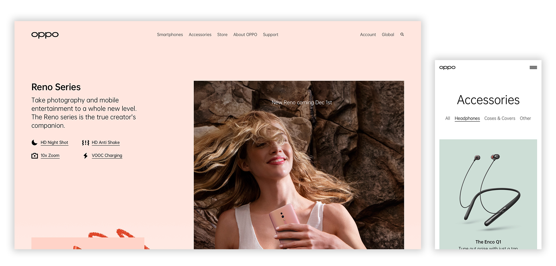
Final screens for the OPPO.com-platform, showing the Reno Series and Accessories page.
Challenges
OPPO reached out Hello Monday to help redesign their global website, with the goal of further engaging users and making them deepen their consideration of OPPO’s products, brand, and services.
- Bring to life a distinct OPPO brand aesthetic
- Lead users through a curated content journey
- Scale easily across global markets
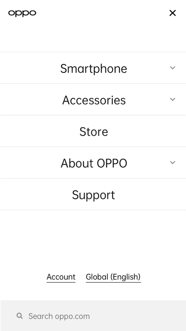
Recorded interaction example made on the
usability tested top navigation.
My role
In this project, my role was to carry out UX Research to help define and support IA, UX Design, and copywriting.
I planned and facilitated a remote usability testing setup to gain insights and refine designs.
Define target audience → plan → test → refinement.
○ Desk research
○ Persona
○ User journeys
○ Wireframing
○ Usability testing
○ SUS-survey

Screenshots from 12 usability tests across Japan, Netherlands, Italy and India conducted remotely. Blurred for privacy.
Process
Usability testing was key in determining how the new OPPO.com would work in real-world conditions with a youthful, tech-savvy, and creative audience spread across a global market.
Based on how participants understood and used our design, we were able to shape common principles for further important design refinement. Specifically, we used the insights to create and refine batches of wireframes for pages to be designed.
“I would like to be guided more into a quick understanding of the positioning of the series – high, mid, entry.”
Quote from a usability session – used to frame an insight, that context and logical
information helped them navigate and create a sense of hierarchy.
The ultimate goal of the usability testing was to identify ways to increase engagement, reduce bounce rate, and drive consideration for OPPO by leading users through relevant content journeys.
Presentation with wireframes for final revision
before going into UI Design.
Learnings
Having a batched approach to the design process worked in favor of both IA, UX, research, and copy. This meant, that we could feed input and insights into the design process in a more agile way.
Learnings from usability testing helped the whole team elevate the designs – even if it was only slight tweaks. It helped us boost our rationale for design decisions.